Table of Contents
UBC Learning Analytics Hackathon
A group of 4 of us from the University of British Columbia Masters of Data Science Program consisting of Mohammad Reza (Nabi) Nabizadeh, Jonah Hamilton, Caroline Tang and myself put our skills to the test by signing up for a hackathon put on by the UBC Learning Analytics Team.
We were fortunate enough to be voted as one of the top 3 projects at the hackathon and will be presenting to the broader learning analytics team in the coming weeks, hence the big smiles all around in our team photo! You’ll find a brief breakdown of what the problem was and how we approached it below.

The challenge was simple:
How can we use UBC’s learning data to improve learning outcomes, our understanding of learning, or teaching capabilities
Learning outcomes can be in the form of helping students who are struggling or getting students to a deeper understanding of topics faster.
Understanding learning is looking into the underlying process students go through when encountering new information and the use of things such as repetition or different teaching techniques (audio, visual etc.).
Teaching capability is around prioritizing developing strong teaching best practices and providing feedback/tools for professors to gauge how they are doing (which is hard!).
Exploration: What Do We Tackle?
As the challenge was left quite open ended in terms of problem statement, we worked as a group and started brainstorming what sort of problems we knew or think professors had when teaching courses. Luckliy one of our team members, Nabi, has experience teaching Digital Marketing and had useful insights into how digital learning is tough from a professor point of view.
The hackathon included datasets from the UBC learning website, Canvas, which we used to guide our thinking as we came up with different problem statements.
Canvas is setup to help professors manage:
- Required/Optional Discussion Topics
- Assignments
- Quizzes
- Grades
- Syllabus
- Announcements
The data included:
- Course Website Event Stream - who did what on the website & when
- Course Discussion Board Posts/Like - no text of the actual posts but length of post, number of likes on a post etc.
- Course Grades - a disparate combination of 3 assignments, final grade, and a participation grade
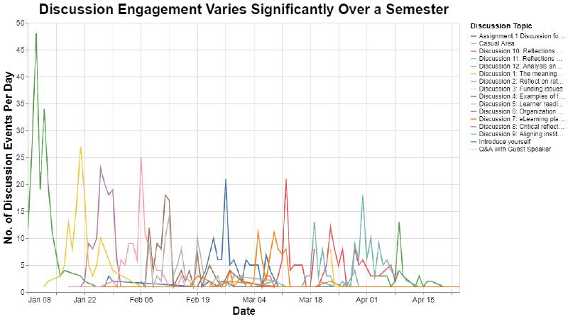
After running through some quick and dirty wrangling and exploratory data analysis we noticed two things:

The course data we had access to had a participation/engagement grade given by the professor at the end of the course which accounted for a small portion of the students final grades. As one of the only true measures of the users engagement you can see above the more engaged students did better overall.

This shows how student engagement in discussions can vary by assignment, time in the semester, and likely many more factors. When our team looked at this and tried to understand when/how engagement could be measured it got our analytical gears turning.
Now the difficult part with Canvas is that since there are so many different avenues to engage students (discussions, assignments, quizzes, etc.) how do you know if somebody is engaged or not?
This formed the basis of our challenge statement:
Challenge: Can We Know How Engaged Students are at Any Time?
The use case for this is that you’re a professor and you have a class of 50 students. You post discussion topics your students must engage with, they submit their assignments on canvas and they write practice quizzes and their actual quizzes on Canvas.
Now if a student interacts with multiple parts of the website, which do you measure as most important to cultivating engagement? Are discussion boards better than practice quizzes? Does submitting more revisions of an assignment mean they engaged with the content more?
We didn’t have the answer to those questions and think professors don’t either, so how do you ACTUALLY measure engagement of students?
Solution: PULSE - Relational Engagement Measurement
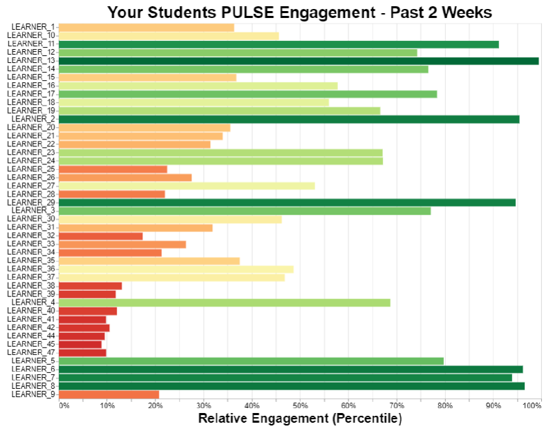
Our chosen approach was to not pick and choose engagement channels but instead combine them into a meaningful measurement of engagement which we’ve called PULSE. This is what a courses PULSE engagement looks like with each bar representing a student’s PULSE engagement:

The other challenge we’ve attempted to solve with PULSE is that for any given channel, who’s to say what the “right” amount of engagement is?
To get around this we’ve assumed that in any given course it’s likely to have a distribution of students ranging from high engagement, high achievers with lots of time to dedicate to studies and low engagement students potentially with significant barriers to learning. These are the learners professors can help the most.
Using this somewhat “Normal Distribution of Learners” we can take each engagement channel and use the fact that some will engage more/less and some right in the middle. But the key to this is professors can see who is engaging less and help them.
The diagram below shows at a high level how the system works.

Improvements & Final Presentation
As the hackathon was just 8AM - 4PM before presentations there were a number of items on our list we didn’t get to complete that we planned to do to improve our solution:
Validate our assumption of normality for each engagement channel
This was a key assumption and we planned to review the calculated summary statistics and run the Shapiro-Wilkes test for normality on each channels distribution. One issue we foresaw with this is that with such a small dataset (~30 students) we may be underpowered in our results. An idea to manage this is to chunk the data into week long blocks as individual data points to estimate the distribution of engagement over a full semester.Build a final grade prediction model based on course to date engagement results
This could be useful for professors or students to see how they’re doing and provide feedback on their trajectory to be able to make adjustments to both teaching and study habits. One tricky part with this will be how to manage assignment grades and weightings towards final grades but a potentially naïve approach that doesn’t use them at all and just looks at engagement would likely be interesting.Use the professor’s engagement data to give insight into what they’re doing that’s driving engagement
There was data on the professors activity on Canvas for thing such as discussion posts/replies, posting grades etc. Running analytics on uplift of engagement based upon the specific course/instructor interaction could help the professors understand what they’re doing that is working well like timely replies to discussions, time to return grades, etc.
Fortunately we were voted by our peers at the hackathon as being one of the top 3 projects so we will be presenting our project to a wider audience form the UBC Learning Analytics team.
Huge thanks to Alison Myers & Craig Thompson from the UBC Learning Analytics team for hosting!


